

Adobe Plus Power BI: Tracking Website Performance with Site Health Dashboards


Adobe Analytics is a web analytics tool that provides robust, real-time data reporting and analysis capabilities. However, relying on the tool solely can sometimes limit what you can give to the end user. Our ‘Adobe Plus’ series explores real-life use cases of how combining Adobe with additional tools can elevate your analytics.
In this ‘Adobe Plus Power BI’ use case, we look at site health dashboards, which serve as a centralised space for tracking and analysing KPIs, allowing businesses to detect any sudden changes or anomalies. They are crucial to monitor the accuracy of analytics tracking, and regular review of the dashboard is essential, particularly after a release, to quickly pinpoint and address any issues.
We will start by talking about the role of Adobe Analytics in creating these dashboards, how Power BI could extend it’s capabilities and how we integrated both tools to effectively monitor the performance of a client’s website.
Site Health Dashboards and the Role of Adobe Analytics:
Site health dashboards present key performance metrics, usually, aggregated and visualised over time. This could be on a line graph, or percentage change, e.g., month-on-month. This allows stakeholders to see trends and identify any unusual spikes or dips in the data. To gain deeper insights, these dashboards can also analyse metrics by specific dimensions to determine the source of any changes, for example, performance by device, marketing channel, or day of week. To ensure accurate analytics tracking, it is recommended to trend variables such as props, eVars, and events (your Solution Design Reference is the starting point). By visualising their occurrence over time, any potential tracking issues can be recognised.
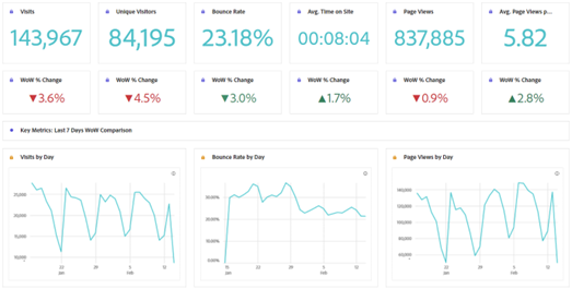
Choosing the right metrics is a fundamental decision when building a site health dashboard. Each metric provides a different perspective on website performance, so we can focus on areas that require attention. The following are commonly used metrics:
- Visits and Unique Visitors represent the number of times users access your website, which helps gauge the overall volume of traffic to your site and size of your audience.
- Page Views represent the depth of engagement with your content.
- Bounce Rate measures the proportion of users who land on a page and then exit without interacting; a high bounce rate may indicate the landing page isn’t engaging visitors.
- Revenue tells us the financial impact of your online presence.
- Time Spent per Visit and Page Views per Visit help assess the depth of user engagement and content quality.
- Conversion Rate (CR) calculates the percentage of visitors who take a desired action, such as making a purchase or signing up for a newsletter, and is key to assess if your website is achieving specific goals.
Adobe Analytics is really useful for this, as it shows us all the data tracked via the website, and Adobe Workspace is a great data visualisation tool, perfect for presenting analytics tracking since it can provide real-time data. Adobe Analytics also has a number of features you should use for Site Health Dashboards:
- Drop-Down Filters can be added to panels, which allow users to focus on specific dimensions, such as device or operating system. This allows more granular analysis, where users/teams can drill down into the data that matters most to them.
- Automated Alerts set up in conjunction with the dashboard can ensure timely detection of significant changes or anomalies by notifying relevant stakeholders when predefined thresholds are exceeded.
- Sharing dashboards in Adobe Analytics is simple; access for specific users or groups can be provided based on different levels of permissions. The dashboards can also be scheduled to be sent via email on any frequency, to help streamline the reporting process. Users can also export the dashboard as a CSV or PDF, making it easy for non-Adobe users to access the data.
When starting this project, it was clear our client’s requirements were beyond the capabilities of Adobe Analytics alone. The main reason for incorporating Power BI was to include data from external sources – which were just as important to track for the client. Having all the relevant data in one place would be much more efficient for the end-user and avoid multiple reports with all the issues that causes. Also, as this dashboard could be shared within the organisation, we wanted to provide a more dynamic, visually engaging and user-friendly report than we normally can in Adobe Analytics.
Extending Capabilities with Power BI:
Based on the company’s specific requirements and the report’s audience, utilising both Adobe Analytics and Power BI was more appropriate in effectively keeping everyone aligned and informed. There are a few key features of PowerBI that were crucial to the project
- Connectivity and Integration: Power BI is great in connecting different data sources for a comprehensive dashboard view, seamlessly merging various platforms into one, whereas Adobe Analytics generally requires more manual effort in integrating data sources, unless you have everything piped up to their Real-Time CDP.
- Data Visualisation: With a bit of work, Power BI can create visually pleasing and interactive reports, which stakeholders tend to engage with and understand more. Adobe Analytics has limitations in their interactivity and customisations, in comparison to Power BI.
- Accessibility and Sharing: Power BI allows you to share dashboards with specific users, publish it online, or even embed it in other platforms or websites, making it accessible to a much wider audience (although additional licenses may be required for some users). Whilst Adobe Analytics provides a number of sharing options, it is not nearly as customisable and flexible.
Integration in Action:
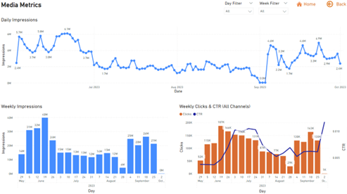
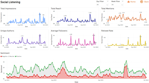
For our client’s dashboard, we started with Adobe Analytics. Essential KPI’s were identified and exported from Adobe Analytics, and we confirmed with the client what aspects of their day-to-day Adobe Workspace reports they liked, and they wanted to improve. Other data sources were identified, such as social listening data to enrich our insights with external perspectives, and media metrics such as campaign clicks and impressions, which were not available in Adobe.
Utilising Power BI’s integration capabilities, ingested and transformed these different datasets into engaging report using custom colours, conditional formatting for percentage change callouts, and interactive graphs. The use of dropdown menus to filter by specific days or weeks also meant we could let the users choose their own view of the data without technical knowledge.
As there was a lot to digest, we used multiple pages and buttons to create a report which had all the data and was easy to navigate. Best Practice Tip: split different datasets into sheets to avoid too much data in one view, and add back and home buttons to make it easy to navigate. The overall output was much more engaging and more user-friendly to the non-Adobe users!
The Power of Adobe Plus:
When to use Adobe Workspaces
Adobe Workspaces can be used to create a rich set of metrics quickly, and is well-suited for businesses looking for a straightforward method to web performance monitoring. If you have capable web analysts, all the data you want in Adobe Analytics and the intended audience is comfortable with the system, then this is the best place to start.
When to use Adobe Plus Power BI
If you have to bring together data from different sources, especially if you need to transform and clean that data, if you have non-technical stakeholders who love a pretty graph and hate a table and especially if you have lots of different people who are going to be more interested in specific parts of the dashboard, then Adobe Plus PowerBI is the way to go.
If you dont have a Site Health dashboard currently, or need some assistance with effectively visualising data within your organisation, please get in contact with Steven.Garrett@station10.co.uk.